To further share the Cove Street research communication duty, I introduce Analyst Eugene Robin.
– Jeffrey Bronchick, CFA | Principal, CIO
DATA MINING: THE GIFT AND THE CURSE
by Eugene Robin, CFA | Research Analyst
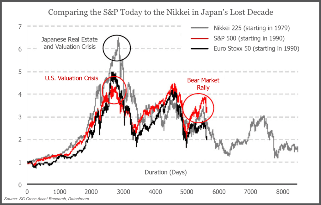
Reading over some of the “doomsday” commentary in the financial blogosphere, it sometimes appears as if graphs posted by some of the authors are poignant and relevant to the here and now. As the below graph indicates (presented as a reprint from Societe General’s Research via the blog Zero Hedge), it appears as if the historical movements of the Nikkei and S&P are genuinely linked by some mysterious force. In fact, the author’s insinuation is that there is a hidden hand that is actively causing the S&P 500 to retrace the path the Nikkei has taken since 1979, imploring all of us to stare in awe at the impending doom about to befall our markets.
Unfortunately, statistics aren’t quite that simple. I’m sure most of us have heard of the statistician’s mantra “causation implies correlation, but correlation does not imply causation.” The aforementioned chart is a perfect example of this maxim. Briefly, if a positive correlation exists between two variables then high values of one variable imply high values of the other (and vice versa), which appears to give us a cause/effect relationship between the two variables. While it may appear that the above graph shows a mystical cause/effect relationship between the two historical paths (Nikkei vs. S&P), what we are in fact looking at is an elaborate example of data mining.
The creator of this chart selected a time series that included a number of similar market stimuli, primarily a real estate asset bubble that subsequently collapsed. However, both periods also include major government interventions that, not surprisingly, may have caused bounces in the stock indices. In reality, the deception behind the chart stems from the fact that the similarities must end at this point. The fact that the S&P has followed a similar path has absolutely no bearing on the future and will not dictate whether the index continues to trace the Nikkei. No matter how eerie the supposed correlation is, the truth is that there are an infinite number of variables that are different when comparing the two time periods.
Specifically, while the cause of the market moves appear to be similar, to have correlation indicate causation one must prove that there is no tertiary element that acts on the variable of interest but has not yet been measured. For example (taken from the Data Mining Lab blog), in American elections if you were to run a regression against the winners and the popular vote you might get a strong correlation between winning an election and winning the popular vote. Of course, as we all know there exists one extra variable in this equation: the Electoral College. Just because you win the popular vote does not imply that you will win the presidency thanks to the mechanics of the Electoral College (just ask Al Gore). By choosing a specific time period, 1979-present for the Nikkei and 1990-present for the S&P, the author traces out his thesis based on the assumption that there are no other extraneous variables that act on the behavior of our two primary variables (Nikkei, S&P) and that both time series represent identical conditional sets. He also wants us to assume that taking the Nikkei’s returns in dollar terms and converting out of dollar terms for the S&P has been done correctly.
Yet, is this really the case? Can we say that these two time periods, and specifically the two countries in question are at all linked aside from the obvious similarities? Are the data series described correctly in terms of currency de-linked returns? If we select a different set of years, would the analysis stand? Was the real estate bubble of the Japanese 1980s mechanically identical to the tech bubble of the 90s? Was the Bank of Japan’s reaction post-1991 identical to the Federal Reserve’s actions post-2001? Were the fundamentals of the two nation’s economies identical enough to draw any comparisons at all? Lastly, why would the U.S. market look like the Japanese market over the course of 30 disjointed years?
Practically, the easiest way to defeat the allure of any data mining analysis without the use of any statistics is to analyze the data via a “smell test.” Just ask yourself a few of the previous questions about the relevance of the comparison and see if it passes all, some or none of them. Alas, most chartists fail to do even the basic amount of work to qualify their attempts to divine the future from the past. Charts such as this should make you think about linkages, but not blindly follow them.

